
Showing posts with label CSS and HTML. Show all posts
Showing posts with label CSS and HTML. Show all posts
Hello Friends I am gona to show you how to add social sharing button bellow post title in blogger.
<b:if cond='data:blog.pageType == "item"'>
<table border='0'>
<tr>
<td><div style='margin-right:5px;'>
<g:plusone expr:href='data:post.url' size='medium'/>
</div>
</td>
<td><div style='padding-top:6px;'>
<script type='text/javascript'>
tweetmeme_style = "compact";
</script>
<script src='http://tweetmeme.com/i/scripts/button.js' type='text/javascript'/>
</div></td>
<td><div style='margin-right:25px;'>
<script expr:src='"http://www.stumbleupon.com/hostedbadge.php?s=1&r=" + data:post.url'/></div>
</td>
<td><div style='margin-right:25px;'>
<div id='fb-root'/><script src='http://connect.facebook.net/en_US/all.js#xfbml=1'/><fb:like font='' href='' layout='button_count' send='true' show_faces='false' width='40px'/>
</div>
</td>
<td>
<!-- AddThis Button BEGIN -->
<div class="addthis_toolbox addthis_default_style ">
<a class="addthis_counter addthis_pill_style"></a>
</div>
<script type="text/javascript" src="http://s7.addthis.com/js/250/addthis_widget.js"></script>
<!-- AddThis Button END -->
</td>
</tr>
</table> </b:if><br/>
5. Next search for </head>
6. and just above it paste the following code,
How to Add This Widget.
- Go To Blogger > Design > Edit HTML
- Backup your template
- Search for <data:post.body/>
- and just above it paste the code given below,
<b:if cond='data:blog.pageType == "item"'>
<table border='0'>
<tr>
<td><div style='margin-right:5px;'>
<g:plusone expr:href='data:post.url' size='medium'/>
</div>
</td>
<td><div style='padding-top:6px;'>
<script type='text/javascript'>
tweetmeme_style = "compact";
</script>
<script src='http://tweetmeme.com/i/scripts/button.js' type='text/javascript'/>
</div></td>
<td><div style='margin-right:25px;'>
<script expr:src='"http://www.stumbleupon.com/hostedbadge.php?s=1&r=" + data:post.url'/></div>
</td>
<td><div style='margin-right:25px;'>
<div id='fb-root'/><script src='http://connect.facebook.net/en_US/all.js#xfbml=1'/><fb:like font='' href='' layout='button_count' send='true' show_faces='false' width='40px'/>
</div>
</td>
<td>
<!-- AddThis Button BEGIN -->
<div class="addthis_toolbox addthis_default_style ">
<a class="addthis_counter addthis_pill_style"></a>
</div>
<script type="text/javascript" src="http://s7.addthis.com/js/250/addthis_widget.js"></script>
<!-- AddThis Button END -->
</td>
</tr>
</table> </b:if><br/>
5. Next search for </head>
6. and just above it paste the following code,
<script src='http://apis.google.com/js/plusone.js' type='text/javascript'> {lang: 'en-US'} </script>
7. Save your template and you are done!
Hello Friends i am gone a to tell you How to add reply button/link to blogger comments form.Mostly this type of comment form can only seen on wordpress blog,now this is the chance for blogger users.I am sure you would love to add it to your blogs too. So let's do it!

/*--------------MBT Reply Link --------------*/
.MBT-replycomments{
background:#ECEAEA;
cursor:pointer;
color:#fff;
margin:5px 0;
float:right;
border:none;
padding:4px;
-moz-border-radius:6px;
-webkit-border-radius:6px;
border-radius:6px;
font:10px sans-serif;
}
.MBT-replycomments:hover{
background:#E7E7E7;
}
Make these changes:

How To Add Reply Button/Link ?
- Go To Blogger > Design > Edit HTML
- Backup your template
- Click the "Expand widgets Templates" Box
- Search For ]]></b:skin>
- and paste the code below just above it,
/*--------------MBT Reply Link --------------*/
.MBT-replycomments{
background:#ECEAEA;
cursor:pointer;
color:#fff;
margin:5px 0;
float:right;
border:none;
padding:4px;
-moz-border-radius:6px;
-webkit-border-radius:6px;
border-radius:6px;
font:10px sans-serif;
}
.MBT-replycomments:hover{
background:#E7E7E7;
}
Make these changes:
- To Change the Link background on active mode edit #ECEAEA
- To Change the Link Background color on mouse hover edit #E7E7E7
- Our Color Generator tool will be helpful
<dd class='comment-footer'>
or just this,class='comment-footer'
and just above it paste the "Reply Link" Code below,<div class='MBT-replycomments'><a expr:href='"https://www.blogger.com/comment.g?blogID=*******************&postID=" + data:post.id + "&isPopup=true&postBody=%40%3C%61%20%68%72%65%66%3D%22%23" + data:comment.anchorName + "%22%3E" + data:comment.author + "%3C%2F%61%3E#form"' onclick='javascript:window.open(this.href, "bloggerPopup", "toolbar=0,location=0,statusbar=1,menubar=0,scrollbars=yes,width=650,
height=650"); return false;'>Reply..</a></div>
height=650"); return false;'>Reply..</a></div>
- You can replace the text Reply.. with anything you like
- Replace with your BLOG ID. If your are logged into your blogger account then look at your browser address bar. You can clearly see a 18-19 digit code. Just copy it and paste it in place of *******************
7. Save your template and view your blog comments.The Look Like Wordpress Comments.Enjoy! :>
Hi friends today i am publishing a great tool.The widget below automatically turns the square edges of your image into rounded corners. The rounder corner pixel size can easily be adjusted. Once you submit the image, you will be taken to next window where you can set border radius size along with image quality and background colours. You can choose to set a background or keep the background transparent. You can also choose which of the four borders you wish to be curved and which should be left as default. You can either upload the image, photo or picture from your computer or you can enter the Image direct link/URL.

You don't need a Photoshop or any other software or tech knowledge to round your images.If you are creating an object using CSS then better apply the following property to produce rounded corners.
border-radius:10px;
-moz-border-radius:10px;
-webkit-border-radius:10px;
This widget is a coutesy of roundpic.
You don't need a Photoshop or any other software or tech knowledge to round your images.If you are creating an object using CSS then better apply the following property to produce rounded corners.
border-radius:10px;
-moz-border-radius:10px;
-webkit-border-radius:10px;
Tool for Rounding Your Images
This widget is a coutesy of roundpic.
Hi Friends i have founded a new sticky bar for blogger with close message or button.This is a new kind of sticky bar.Many webmaster have search for this.Today i will let you that how to apply it on a blog/website.While viewing one of the Wordpress Blogs I found this button next to their updates bar. I managed somehow to fetch the script half broken. Making it work with blogger template was difficult because blogspot templates are programmed via XML and the rules of XML are really harsh when it comes to Character case. Debugging the script was difficult but Alhamdulillah the hard work paid off. You can see it Live just to the right of my Stickybar at the top. I am excited to share it with you all. Lets get to work!

4. Just above it paste the following CSS code,
5. Next search for </head> and paste the following Javascript code just above it
<script type='text/javascript'>
//<![CDATA[
var mbt_arr = new Array();
var mbt_clear = new Array();
function mbtFloat(mbt) {
mbt_arr[mbt_arr.length] = this;
var mbtpointer = eval(mbt_arr.length-1);
this.pagetop = 0;
this.cmode = (document.compatMode && document.compatMode!="BackCompat") ? document.documentElement : document.body;
this.mbtsrc = document.all? document.all[mbt] : document.getElementById(mbt);
this.mbtsrc.height = this.mbtsrc.offsetHeight;
this.mbtheight = this.cmode.clientHeight;
this.mbtoffset = mbtGetOffsetY(mbt_arr[mbtpointer]);
var mbtbar = 'mbt_clear['+mbtpointer+'] = setInterval("mbtFloatInit(mbt_arr['+mbtpointer+'])",1);';
mbtbar = mbtbar;
eval(mbtbar);
}
function mbtGetOffsetY(mbt) {
var mtaTotOffset = parseInt(mbt.mbtsrc.offsetTop);
var parentOffset = mbt.mbtsrc.offsetParent;
while ( parentOffset != null ) {
mbtTotOffset += parentOffset.offsetTop;
parentOffset = parentOffset.offsetParent;
}
return mbtTotOffset;
}
function mbtFloatInit(mbt) {
mbt.pagetop = mbt.cmode.scrollTop;
mbt.mbtsrc.style.top = mbt.pagetop - mbt.mbtoffset + "px";
}
function closeTopAds() {
document.getElementById("mbt_bar").style.visibility = "hidden";
}
//]]>
</script>
6. Finally search for <body> and just below it paste the following HTML code
<div id='mbt_bar'> WRITE YOUR TEXT HERE
<span style='padding:0px; float:right'>
<img align='absmiddle' border='0' onClick='closeTopAds();return false;' src='https://blogger.googleusercontent.com/img/b/R29vZ2xl/AVvXsEjalQ1Mdrpeo5NW5VSrXDKVeGMRCCraZQJ6Gi7W2srAHhhgOAFr2UXCc8es4Dzsn6c0f2rmjvCyO11nfKiRYFYCIVoOaaXmvcQwD8yX7AJQ6vTub6nwGrtm8DVdr9uIEXQWIfKl_baELv8/s400/cancel.png' style='cursor:hand;cursor:pointer;'/></span></div>
<br/><br/>
To write any updates or anythig, just replace the Green highlighted text with your message. If you wish to change the Close button image then simply replace the bolded black link with your button's link.
7. Save your template
8. You are all done!
Steps To Create Sticky Bar.
Follow these easy steps:
- Go To Blogger > Design > Edit HTML
- Backup your template
- Search for this
]]></b:skin>
4. Just above it paste the following CSS code,
#mbt_bar{
background:#333 url('https://blogger.googleusercontent.com/img/b/R29vZ2xl/AVvXsEiGIoHDM3XLojZzLETaHvmhLRMQ4xob-Vb_yppzxgWAFKq2KxeS8TmL1gY_ie2L9I7ZHI9Qp3Vc9bYx_JF3dK-dGs3u6xG4kvjWrYuACLGG8ivgWkS7YYRSkIzQmOdDhv0bjAdhnLz5p-U/s400/stickybar.png') repeat-x;
width:100%;
margin:0 auto;
text-align:center;
padding:0px 0;
border-bottom: 1px solid #888888;
-moz-box-shadow: #666666 0px 1px 3px;
-webkit-box-shadow: #666666 0px 1px 3px;
box-shadow: #666666 0px 1px 3px;
z-index: 999;
height: 28px; position:fixed;
line-height: 1.85em;
vertical-align: baseline;
letter-spacing: 1px;
color:#fff;
font-size:13px;
font-weight:bold;
font-family: arial,"Helvetica",sans-serif;
}
#mbt_bar a{
text-decoration:underline;
color:#E2E504;
}
#mbt_bar a:hover{
text-decoration:none;
}
#mbt_bar p {margin:0; list-style:none;}
#mbt_bar img {vertical-align: middle;
margin-right: 6px;}
5. Next search for </head> and paste the following Javascript code just above it
<script type='text/javascript'>
//<![CDATA[
var mbt_arr = new Array();
var mbt_clear = new Array();
function mbtFloat(mbt) {
mbt_arr[mbt_arr.length] = this;
var mbtpointer = eval(mbt_arr.length-1);
this.pagetop = 0;
this.cmode = (document.compatMode && document.compatMode!="BackCompat") ? document.documentElement : document.body;
this.mbtsrc = document.all? document.all[mbt] : document.getElementById(mbt);
this.mbtsrc.height = this.mbtsrc.offsetHeight;
this.mbtheight = this.cmode.clientHeight;
this.mbtoffset = mbtGetOffsetY(mbt_arr[mbtpointer]);
var mbtbar = 'mbt_clear['+mbtpointer+'] = setInterval("mbtFloatInit(mbt_arr['+mbtpointer+'])",1);';
mbtbar = mbtbar;
eval(mbtbar);
}
function mbtGetOffsetY(mbt) {
var mtaTotOffset = parseInt(mbt.mbtsrc.offsetTop);
var parentOffset = mbt.mbtsrc.offsetParent;
while ( parentOffset != null ) {
mbtTotOffset += parentOffset.offsetTop;
parentOffset = parentOffset.offsetParent;
}
return mbtTotOffset;
}
function mbtFloatInit(mbt) {
mbt.pagetop = mbt.cmode.scrollTop;
mbt.mbtsrc.style.top = mbt.pagetop - mbt.mbtoffset + "px";
}
function closeTopAds() {
document.getElementById("mbt_bar").style.visibility = "hidden";
}
//]]>
</script>
6. Finally search for <body> and just below it paste the following HTML code
<div id='mbt_bar'> WRITE YOUR TEXT HERE
<span style='padding:0px; float:right'>
<img align='absmiddle' border='0' onClick='closeTopAds();return false;' src='https://blogger.googleusercontent.com/img/b/R29vZ2xl/AVvXsEjalQ1Mdrpeo5NW5VSrXDKVeGMRCCraZQJ6Gi7W2srAHhhgOAFr2UXCc8es4Dzsn6c0f2rmjvCyO11nfKiRYFYCIVoOaaXmvcQwD8yX7AJQ6vTub6nwGrtm8DVdr9uIEXQWIfKl_baELv8/s400/cancel.png' style='cursor:hand;cursor:pointer;'/></span></div>
<br/><br/>
To write any updates or anythig, just replace the Green highlighted text with your message. If you wish to change the Close button image then simply replace the bolded black link with your button's link.
7. Save your template
8. You are all done!
Visit your blog to see it fixed to the top just beautifully with a close button waiting to be clicked!
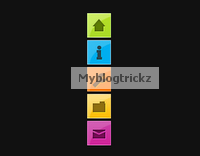 Hi Friends.In this post i have a very stylish and colorful menu for you.You can fix to the side of the page on your Blogger blog.The menu will stay in place even when the reader scrolls down yet doesn't interfere with the content.The menu has 5 icons that on hover scroll out to reveal their purpose, so for example the home icon on hover scrolls out the word 'Home'.The 5 icons are for Home, About, Services, Portfolio and Contact Us.While you cant change the icons, you can change the text for each icon for example the portfolio icon could be changed to archive.
The menu is made up almost completely of Css3 with just one image and is quick and easy to install.All the credit for the menu goes to the awesome Tutorialzine, we have covered many of their tutorials previously.Below you can see a live demo, hover over the icons to see the scroll out effect.
How To Add The Fixed Navigation Menu
- Go To Blogger>>>>Design>>>>Edit HTML
- CTRL+F To Find ]]></b:skin>
- Copy And Paste Below Code Just Before/Above ]]></b:skin>
/* CSS Style for Horizontal Menu - info @ http://www.myblogtrickz.blogspot.com*/ #hor { list-style:none; padding:0; margin:0; } #hor li { float:left; padding:5px; } #hor a { display:block; height: 12px; text-indent:-999em; } #hor a.home { width:46px; background:url(vHome.gif) no-repeat 0 0; } #hor a.download { width:94px; background:url(vDownload.gif) no-repeat 0 0; } #hor a.contact { width:74px; background:url(vContact.gif) no-repeat 0 0; } /* CSS Style for Vertical Menu */ #ver { list-style:none; padding:0; margin:0; } #ver li { padding:2px; } #ver li a { display:block; height:12px; text-indent:-999em; } #ver a.home { width:47px; background:url(hHome.gif) no-repeat 0 0; } #ver a.download { width:95px; background:url(hDownload.gif) no-repeat 0 0; } #ver a.contact { width:74px; background:url(hContact.gif) no-repeat 0 0; } .clear { clear:both; } *{ /* A universal CSS reset */ margin:0; padding:0; } #navigationMenu body{ font-size:14px; color:#666; background:#111 no-repeat; /* CSS3 Radial Gradients */ background-image:-moz-radial-gradient(center -100px 45deg, circle farthest-corner, #444 150px, #111 300px); background-image:-webkit-gradient(radial, 50% 0, 150, 50% 0, 300, from(#444), to(#111)); font-family:Arial, Helvetica, sans-serif; } #navigationMenu li{ list-style:none; height:39px; padding:2px; width:40px; } #navigationMenu span{ /* Container properties */ width:0; left:38px; padding:0; position:absolute; overflow:hidden; /* Text properties */ font-family:'Myriad Pro',Arial, Helvetica, sans-serif; font-size:18px; font-weight:bold; letter-spacing:0.6px; white-space:nowrap; line-height:39px; /* CSS3 Transition: */ -webkit-transition: 0.25s; /* Future proofing (these do not work yet): */ -moz-transition: 0.25s; transition: 0.25s; } #navigationMenu a{ background:url('https://blogger.googleusercontent.com/img/b/R29vZ2xl/AVvXsEj-91WShKHwrJqyru1HnCydvlwKP1titV5CEaYgAxXxzoVHdoa1_w0u3uueclKWveBI0SnXWVh8bJdLn7ebuk1-75ky6Wb6yegdFs3-w3rN31cYtGKu2bFMNLoYoO4p4p20pAjA3ZhuBfA/s1600/navigation.jpg') no-repeat; height:39px; width:38px; display:block; position:relative; } /* General hover styles */ #navigationMenu a:hover span{ width:auto; padding:0 20px;overflow:visible; } #navigationMenu a:hover{ text-decoration:none; /* CSS outer glow with the box-shadow property */ -moz-box-shadow:0 0 5px #9ddff5; -webkit-box-shadow:0 0 5px #9ddff5; box-shadow:0 0 5px #9ddff5; } /* Green Button */ #navigationMenu .home { background-position:0 0;} #navigationMenu .home:hover { background-position:0 -39px;} #navigationMenu .home span{ background-color:#7da315; color:#3d4f0c; text-shadow:1px 1px 0 #99bf31; } /* Blue Button */ #navigationMenu .about { background-position:-38px 0;} #navigationMenu .about:hover { background-position:-38px -39px;} #navigationMenu .about span{ background-color:#1e8bb4; color:#223a44; text-shadow:1px 1px 0 #44a8d0; } /* Orange Button */ #navigationMenu .services { background-position:-76px 0;} #navigationMenu .services:hover { background-position:-76px -39px;} #navigationMenu .services span{ background-color:#c86c1f; color:#5a3517; text-shadow:1px 1px 0 #d28344; } /* Yellow Button */ #navigationMenu .portfolio { background-position:-114px 0;} #navigationMenu .portfolio:hover{ background-position:-114px -39px;} #navigationMenu .portfolio span{ background-color:#d0a525; color:#604e18; text-shadow:1px 1px 0 #d8b54b; } /* Purple Button */ #navigationMenu .contact { background-position:-152px 0;} #navigationMenu .contact:hover { background-position:-152px -39px;} #navigationMenu .contact span{ background-color:#af1e83; color:#460f35; text-shadow:1px 1px 0 #d244a6; } /*End menu css - info @ http://www.myblogtrickz.blogspot.com */
- Save your template, that's the Css added now for the html.
- Return to your blogs Design or Layout page and click Add A Gadget >>> HTML/Javascript .
- Copy and paste the following code into the HTML/Javascript gadget :
<div style='position: fixed; top: 40%; left: 0%;'/> <ul id="navigationMenu"> <li> <a class="Home" href="http://www.myblogtrickz.blogspot.com"> <span>Home</span> </a> </li> <li> <a class="about" href="http://www.myblogtrickz.blogspot.com"> <span>About</span> </a> </li> <li> <a class="services" href="http://www.myblogtrickz.blogspot.com"> <span>Services</span> </a> </li> <li> <a class="portfolio" href="http://www.myblogtrickz.blogspot.com"> <span>Portfolio</span> </a> </li> <li> <a class="contact" href="http://www.myblogtrickz.blogspot.com"> <span>Contact us</span> </a> </li> </ul> </div><a href="http://www.myblogtrickz.blogspot.com" target="_blank"><small>Get The Fixed Menu Gadget</small></a>
Note- Change the URLs in Blue with your links and You can change the scroll out text in Green above.
Now Save the Gadget.And see your website/blog.
Dont Forget to share this.
Dont Forget to share this.


